

Do not delete anything on this page.
They could be holding classes needed for different states on components
Relume Library Style Guide
HTML tags define default Heading styles.
Heading 1
Heading 2
Heading 3
Heading 4
Heading 5
Heading 5
Heading 6
Heading classes when typography style doesn't match the default HTML tag.
Heading-style-h1
Heading-style-h2
Heading-style-h3
Heading-style-h4
Heading-style-h5
Heading-style-h6
HTML tags define default text styles.
Lorem ipsum dolor sit amet, consectetur adipiscing elit. Suspendisse varius enim in eros elementum tristique. Duis cursus, mi quis viverra ornare, eros dolor interdum nulla, ut commodo diam libero vitae erat. Aenean faucibus nibh et justo cursus id rutrum lorem imperdiet. Nunc ut sem vitae risus tristique posuere.
Block Quote
No bullet list
No bullet list
No bullet list
No bullet list
No bullet list
No bullet list
No bullet list
Text sizes classes when typography size doesn't match the default HTML tag.
Number XL
Lorem ipsum dolor sit amet, consectetur adipiscing elit. Suspendisse varius enim in eros elementum tristique. Duis cursus, mi quis viverra ornare, eros dolor interdum nulla, ut commodo diam libero vitae erat. Aenean faucibus nibh et justo cursus id rutrum lorem imperdiet. Nunc ut sem vitae risus tristique posuere.
Number LARGE
Lorem ipsum dolor sit amet, consectetur adipiscing elit. Suspendisse varius enim in eros elementum tristique. Duis cursus, mi quis viverra ornare, eros dolor interdum nulla, ut commodo diam libero vitae erat. Aenean faucibus nibh et justo cursus id rutrum lorem imperdiet. Nunc ut sem vitae risus tristique posuere.
Number Medium
Overline NORMAL
Lorem ipsum dolor sit amet, consectetur adipiscing elit. Suspendisse varius enim in eros elementum tristique. Duis cursus, mi quis viverra ornare, eros dolor interdum nulla, ut commodo diam libero vitae erat. Aenean faucibus nibh et justo cursus id rutrum lorem imperdiet. Nunc ut sem vitae risus tristique posuere.
Overline SMALL
Lorem ipsum dolor sit amet, consectetur adipiscing elit. Suspendisse varius enim in eros elementum tristique. Duis cursus, mi quis viverra ornare, eros dolor interdum nulla, ut commodo diam libero vitae erat. Aenean faucibus nibh et justo cursus id rutrum lorem imperdiet. Nunc ut sem vitae risus tristique posuere.
Text weight classes when typography weight doesn't match the default HTML tag.
Text style classes when typography style doesn't match the default HTML tag.
Text alignment classes when typography alignment doesn't match the default HTML tag.
Heading 1
Heading 2
Heading 3
Heading 4
Heading 5
Heading 6
This is a block quote
The rich text element allows you to create and format headings, paragraphs, blockquotes, images, and video all in one place instead of having to add and format them individually. Just double-click and easily create content.
This is a link inside of a rich text
- List item
- List item
- List item
- List item
- List item
- List item

Heading 1 goes here
H1 titles are ignored in the table of contents. The table of contents links always start with H2.
Heading 2
Dolor enim eu tortor urna sed duis nulla. Aliquam vestibulum, nulla odio nisl vitae. In aliquet pellentesque aenean hac vestibulum turpis mi bibendum diam. Tempor integer aliquam in vitae malesuada fringilla.
Dolor enim eu tortor urna sed duis nulla. Aliquam vestibulum, nulla odio nisl vitae. In aliquet pellentesque aenean hac vestibulum turpis mi bibendum diam. Tempor integer aliquam in vitae malesuada fringilla.
Heading 3
Eget quis mi enim, leo lacinia pharetra, semper. Eget in volutpat mollis at volutpat lectus velit, sed auctor. Porttitor fames arcu quis fusce augue enim. Quis at habitant diam at. Suscipit tristique risus, at donec. In turpis vel et quam imperdiet. Ipsum molestie aliquet sodales id est ac volutpat.
Eget quis mi enim, leo lacinia pharetra, semper. Eget in volutpat mollis at volutpat lectus velit, sed auctor. Porttitor fames arcu quis fusce augue enim. Quis at habitant diam at. Suscipit tristique risus, at donec. In turpis vel et quam imperdiet. Ipsum molestie aliquet sodales id est ac volutpat.
Heading 4
Morbi sed imperdiet in ipsum, adipiscing elit dui lectus. Tellus id scelerisque est ultricies ultricies. Duis est sit sed leo nisl, blandit elit sagittis. Quisque tristique consequat quam sed. Nisl at scelerisque amet nulla purus habitasse.

Heading 5
Morbi sed imperdiet in ipsum, adipiscing elit dui lectus. Tellus id scelerisque est ultricies ultricies. Duis est sit sed leo nisl, blandit elit sagittis. Quisque tristique consequat quam sed. Nisl at scelerisque amet This is a link
"Ipsum sit mattis nulla quam nulla. Gravida id gravida ac enim mauris id. Non pellentesque congue eget consectetur turpis. Sapien, dictum molestie sem tempor. Diam elit, orci, tincidunt aenean tempus."
Heading 6
Nunc sed faucibus bibendum feugiat sed interdum. Ipsum egestas condimentum mi massa. In tincidunt pharetra consectetur sed duis facilisis metus. Etiam egestas in nec sed et. Quis lobortis at sit dictum eget nibh tortor commodo cursus.
- This is a numbered list
- This is a numbered list
- This is a bullet list and can be long like this Nunc sed faucibus bibendum feugiat sed interdum. Ipsum egestas condimentum mi massa. In tincidunt pharetra consectetur sed duis facilisis metus. Etiam egestas in ne
- Nunc sed faucibus bibendum feugiat sed interdum. Ipsum egestas condimentum mi massa. In tincidunt pharetra consectetur sed duis facilisis metus. Etiam egestas in neNunc sed faucibus bibendum feugiat sed interdum. Ipsum egestas condimentum mi massa. In tincidunt pharetra consectetur sed duis facilisis metus. Etiam egestas in ne
This is an H2 - use an H3 tag if you want it to show up in the indexwant it to show up in the index
A rich text element can be used with static or dynamic content. For static content, just drop it into any page and begin editing. For dynamic content, add a rich text field to any collection and then connect a rich text element to that field in the This is an inline link
Headings, paragraphs, blockquotes, figures, images, and figure captions can all be styled after a class is added to the rich text element using the "When inside of" nested selector system.
This is an H3 use an H3 tag if you want it to show up in the indexwant it to show up in the indexuse an H3 tag if you want it to show up in the indexwant it to show up in the indexuse an H3 tag if you want it to show up in the indexwant it to show up in the index
- Lack of visibility and connection to relevant investors: Researchers struggle to connect and acquire funding from private investors
- Legal complexity of IP deals: Deals such as license agreements surrounding pre-patent and patent IP are complex and often need legal support.
- Difficulty of determining the value of early-stage biopharma assets: Both funders and researchers have trouble assessing the value of early-stage research.
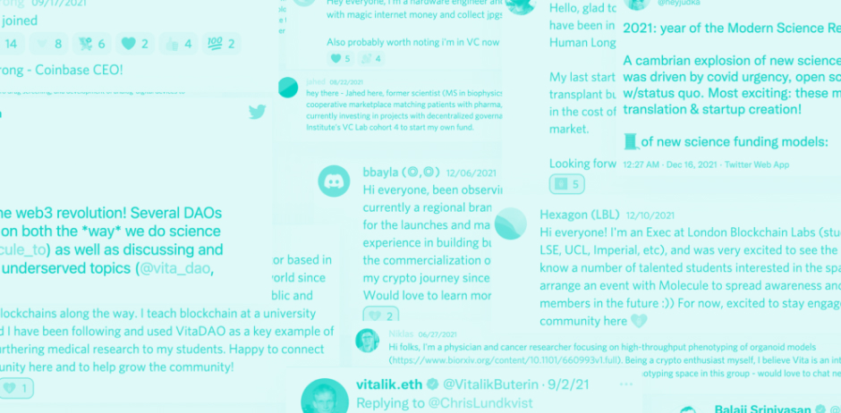
NFTs have created an unprecedented revolution in the creative space, rethinking copyright, royalties and IP. We believe it will also be instrumental in solving the above-stated problems. In this article, we are g
This is an H4
oing to focus on the first technical implementation of a biopharma IPNFT. It builds on many concepts other influential thinkers in the Web3 space have conjured in the past. For example, if you are interested in how general IP can be combined with NFTs have a look at Trent McConaghy 3 part series on building IP NFTs with ERC721. This is regular bold textin the past. For example, if you are interested in how general IP can be combined with NFTs have a look at Trent McConaghy 3 part series on building IP NFTs with ERC721.
Thisioing to focus on the first technical implementation of a biopharma IPNFT. It builds on many concepts other influential thinkers in the Web3 space have conjured in the past. For exoing to focus on the first technical implementation of a biopharma IPNFT. It builds on many concepts other influential thinkers in the Web3 space have conjured in the past. For exoing to focus on the first technical implementation of a biopharma IPNFT. It builds on many concepts other influential thinkers in the Web3 space have conjured in the past. For ex
“When examining the transactional market for biopharma IP, one aspect becomes immediately obvious: IP is not sold in a simple purchase agreement like houses, cars or other physical objects. Transactions involving biopharma IP always differentiate between the specific rights and relating terms of the purchase.”
- Difficulty of determining the value of early-stage biopharma assets: Both funders and researchers have trouble assessing the value of early-stage research.
- Difficulty of determining the value of early-stage biopharma assets: Both funders and researchers have trouble assessing the value of early-stage research.
- Difficulty of determining the value of early-stage biopharma assets: Both funders and researchers have trouble assessing the value of early-stage research.
This is just a paragraph
This is just another paragraph conjured in the past. For exoing to focus on the first technical implementation of a biopharma IPNFT. It builds on many concepts other influential thinkers in the Web3 space have conjured in the past. For exoing to focus on the first technical implementation of a biopharma IPNFT. It build
This is the intro text to the blog. This is the intro text to the blog.This is the intro text to the blog.This is the intro text to the blog.This is the intro text to the blog.This is the intro text to the blog.This is the intro text to the blog.This is the intro text to the blog.This is the intro text to the blog.This is the intro text to the blog.This is the intro text to the blog.This is the intro text to the blog.This is the intro text to the blog.
Get access to pre-made Color Palettes and paste them below.
Manage recurring background colors.
Get access to pre-made Color Palettes and paste them below.
Manage recurring text colors.
Get access to pre-made Text Colors and paste them below.
Shadows allow you to add depth and realism to designs by positioning elements on a z-axis.
icon-height-xxsmall
icon-height-xsmall
icon-height-small
icon-height-medium
icon-height-large
icon-height-xlarge
icon-height-custom1
icon-1x1-xxsmall
icon-1x1-xsmall
icon-1x1-small
icon-1x1-medium
icon-1x1-large
icon-1x1-xlarge
icon-1x1-custom1
HTML embed icons enable you to control icon color on hover.
icon-embed-xxsmall
icon-embed-xsmall
icon-embed-small
icon-embed-medium
icon-embed-large
icon-embed-xlarge
icon-embed-custom1